Adaptive design emerged with the advent of smartphones, better connectivity and mobile apps, has brought about a real revolution. Today, 61% of mobile searches result in a call or visit to the business within 24 hours.
In local seo, searches via mobile devices are fundamental. That is why web designers must take this factor into account when planning the browsing experience.
The web developers y web designers faced a huge challenge. This was due to the wide variety of device types on which the client's page would be displayed to users. The type of design The screen that we are going to use must take into account several premises in order to be displayed correctly on any type of screen.
In order to solve this problem, the concept of the adaptive design o responsive web design.
Adaptive Web Design VS Responsive Web Design
The adaptive design has the task of adjusting the content of any web page to all the type of screen size. We must also add that it is adaptable to all mobile devices. So you may be wondering what responsive design is, it's simply the same thing.
Google has recently incorporated as an important ranking factor the user experience. Within this concept are encompassed different variables that we must optimise for an excellent user experience and thus improve the search engine positioning.
Some of these variables are; web loading speed, architecture, navigability, responsive web design. Design of the website itself, image optimisation, among other things.
Is Responsive Design the same as Adaptive Design?
They are exactly the same as we have explained. The point is that before the responsive design it was specified from the adaptive design. The second evolved and became the first.
When smartphones first appeared, the need arose to adapt content to the device's screen. The goal was to make web pages appear on mobile phones as they do on computer screens.
What did adaptive design initially look like?
Suddenly web developers were forced to think about how to adapt designs to the screens of mobile devices. This process gave rise to the name "responsive design". The default screen sizes at that time were 400×100 pixels for computers and 240×320 pixels for mobile devices.

For this type of design, there was practically no use of the CSS code. This type of design provided solutions to adapt to the screen of the device at the time, however, it was not optimal for web developers.
In the beginning, developers worked day and night to build websites adapted for each device. Today, with the number of different types of smartphones and screens on the market, it would be an impossible and costly challenge.
What is Responsive Design?
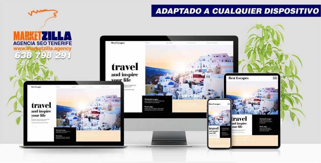
Responsive web design, also called RWD design, describes a modern web design approach. It allows websites and pages to render (or display) on all devices and screen sizes. automatically adapting to the screen. Whether it's a desktop computer, laptop, tablet or smartphone.
The responsive system automatically restructures all the elements of the website to provide an unbeatable user experience (UX). This requires the use of media queries and style sheets in order to set the CSS for each screen size.
In addition, the content is much better organised as there are no horizontal scrolls in responsive designs. The content is displayed vertically, with the possibility of zooming in and out.
In addition, all images, fonts and other HTML elementse will scale perfectly, adapting to any screen size the user may have.

This evolution in web design techniques has been fundamental to improve mobile usability and organic searches through these devices.
Is my website Responsive?
You can easily check this using a free tool. This is the Google mobile optimisation test. This tool checks whether your website pages are optimised for mobile devices automatically. However, you can achieve mobile compatibility with other design approaches. That is why adaptive design, responsive web design, as we have explained, is the most widespread due to its advantages.
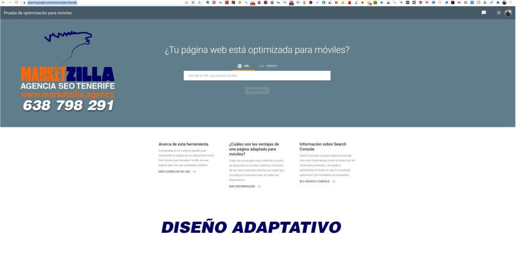

Tool for Google Reponsive Tool
Benefits of Responsive Design
Here are some of the benefits:
1. A place for every device: whether viewed on a 27-inch iMac with a wireless connection or from the screen of your Android phone. The website will be configured for optimal viewing for the user.
2. Optimal design for the device: with the responsive web design approach, all images, fonts and other HTML elements will be scaled appropriately. Maximising whatever screen size the user has.
3. No need for redirection: Other multi-device design options require the use of redirects to send the user to the appropriate version of a web page. Redirects slow down loading speed and ruin the user experience.

Responsive web design is also cost-effective. It is also easier to manage because it is one site instead of two. You don't need to make changes twice. Instead, you can work from a single website and update it.
Examples of Adaptive Web Design
Websites developed in an environment WordPress, Wix or Prestashop, through the themes are usually already responsive. This means that when they are designed they adapt to any screen. However, the web designer must check how it looks in the mobile version as he/she builds it.
In many cases, when content is placed vertically on the mobile device, photos can be too close to the text. This requires spacing within the design. It can also happen that the text is too small and the font size has to be increased.